Most clubs change their logos over time, to stop them from looking dated.
Like clothes, what once looked pretty trendy can soon like rather antiquated.
However if you look at the current and previous iterations of the Manchester City logo, they are very different.
So why did Manchester City change its logo?
Let’s find out…
Why Did Manchester City Change Its Logo?
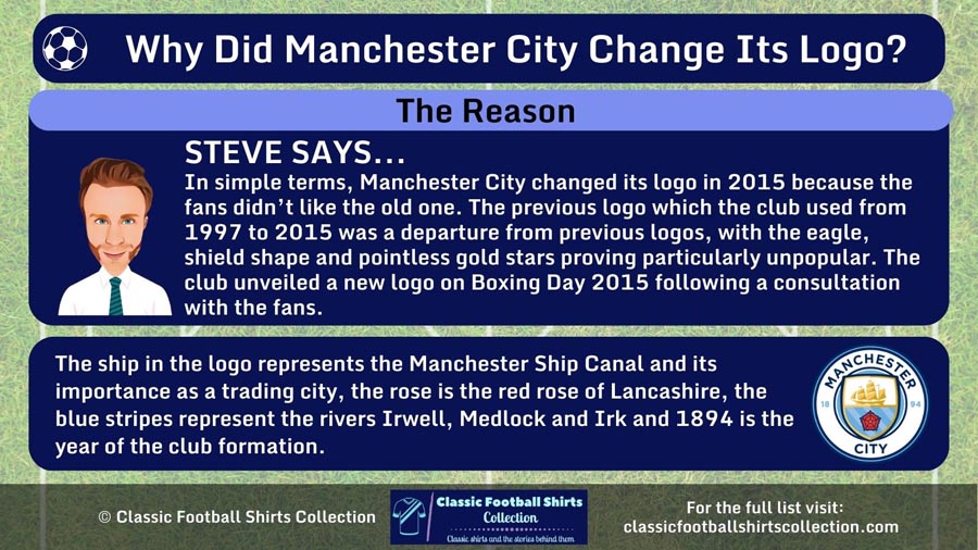
In simple terms, Manchester City changed its logo in 2015 because the fans didn’t like the old one. The previous logo which the club used from 1997 to 2015 was a departure from previous logos, with the eagle, shield shape and pointless gold stars proving particularly unpopular. The club unveiled a new logo on Boxing Day 2015 following a consultation with the fans.

Badge Problems
In 1997 Manchester City adopted a new club badge as a result of the previous badge being ineligible for trademark.
Now if you look across the history of the Manchester City club badge from 1960 to the present day, you will see that the previous logo looks rather incongruous.
Whilst every other logo/badge is circular and simplistic, but rather stylish in design, the club badge from 1997 to 2015 is very different.
It consists of a shield, in front of a golden eagle, and most supporters took an instant dislike to it.
The eagle is an old heraldic symbol of the city but was seen by many fans as purely decorative.
The badge retained a ship to signify the Manchester Ship Canal and its importance as a trading city. It also transferred over three diagonal stripes to symbolise the city’s three rivers, the Irwell, the Irk and the Medlock.
But M.C.F.C. was emblazoned on the logo, rather than Manchester City FC that had adorned previous badges.
At the bottom, the Latin phrase “Superbia in Proelio” (Pride in Battle) appeared for the first time and three gold stars were placed across the top of the badge for nothing other than cosmetic reasons.
After years of criticism, on 15 October 2015, the club announced it would be balloting ‘Cityzens’ (season ticket holders and club members) and giving them the choice of keeping the eagle badge or having a new badge designed.
The final vote was unanimous, fans wanted to change the club badge.
RELATED ===> Revealed: The Best Retro Manchester City Shirts
A Return to the Past

A 30-day consultation period followed and in November 2015 Manchester City announced its new badge would be designed in the style of the older, circular badges.
The new badge was officially unveiled at City’s home match against Sunderland on 26 December 2015.
The new logo was somewhat of a modern take on the 1964 badge and was lauded by the club as a ‘modern original’, portraying the history of Manchester City in a way it was felt the previous badge didn’t.
The eagle, shield, three stars, Latin motto and M.C.F.C were all gone.
RELATED ===> Revealed: Why Do Liverpool Have Two Badges?
As mentioned previously the badge returned to a circular shape and retained the ship and three stripes represent the rivers Irwell, Medlock and Irk.
The most prominent change was the addition of the red rose of Lancashire, of which Manchester is part of, and the inclusion of the club’s foundation year of 1894.
The wording Manchester City, rather than M.C.F.C., returned.
It really was a sea change from the previous badge and was welcomed with open arms by the club’s supporters.
Final Thoughts

In short Manchester City changed its logo/badge, because the fans didn’t like the old one.
The previous club badge, which was in place from 1997 to 2015, was seen as not portraying the history of the club.
The eagle, three gold stars, M.C.F.C. and its shield shape were all particularly disliked and almost from its introduction in 1997 fans had wanted a return to the previous circular club badges.
A consultation with season ticket holders and club members substantiated how unpopular the badge was and the feedback from the fans was received loud and clear.
The club set about designing a new club badge/logo that looked modern and stylish, but still recalled the history of the club.
It was launched on Boxing Day 2015 much to the pleasure of the fans.
